The Haunting Tales of Ottawa
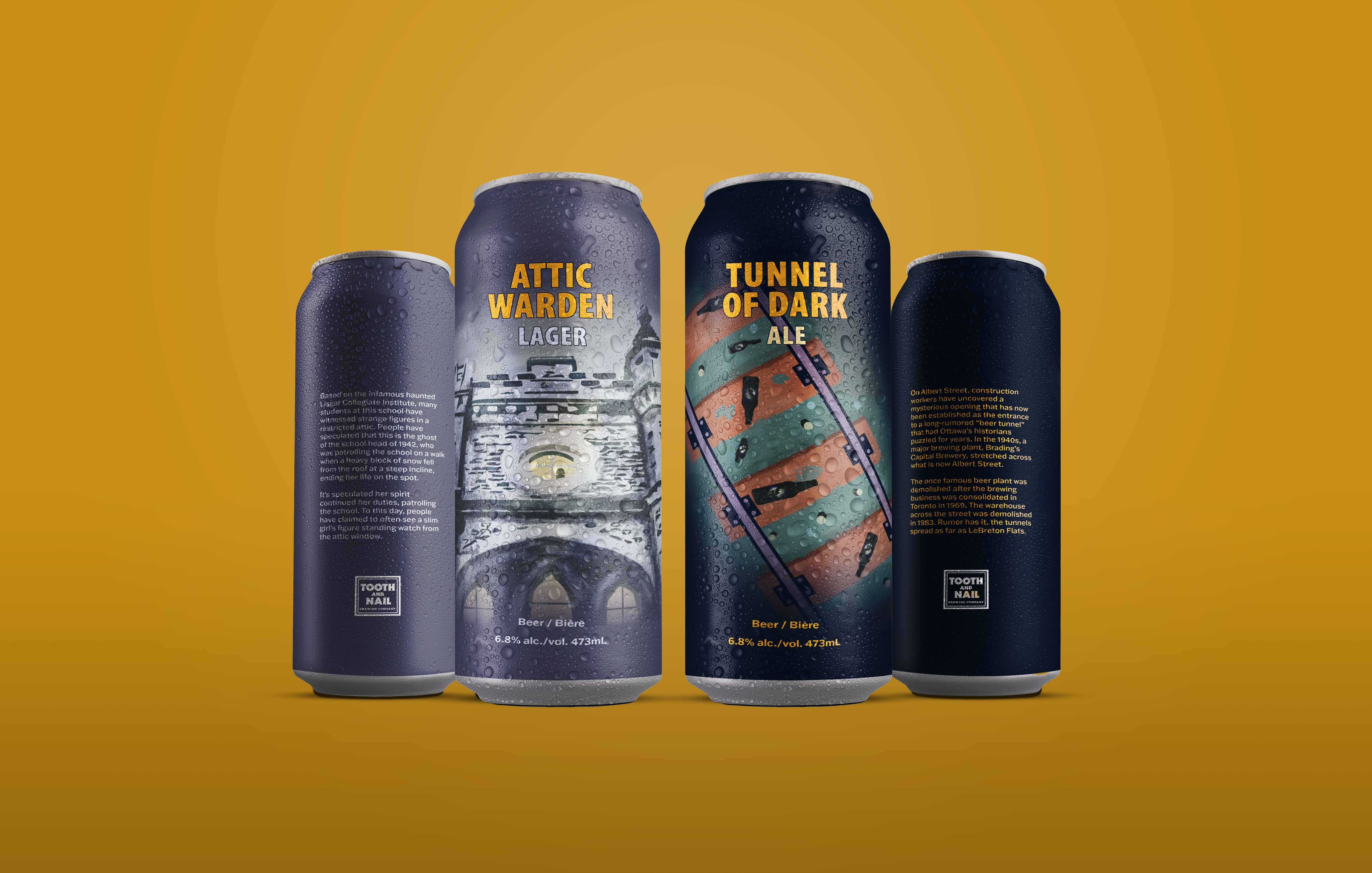
This concept project combined branding and packaging design for beer can designs developed for Tooth & Nail Brewing Company, a local brewery located in the heart of Hintongburg, tucked away in the neighbourhood of Wellington West in Ottawa. The Brewery takes pride in crafting quality beer, authenticity, and a place to foster a warm, welcoming community. Given the brewery has a focus on darker themes, I was inspired to capitalize on that and incorporate some of Ottawa's darker history into a design.
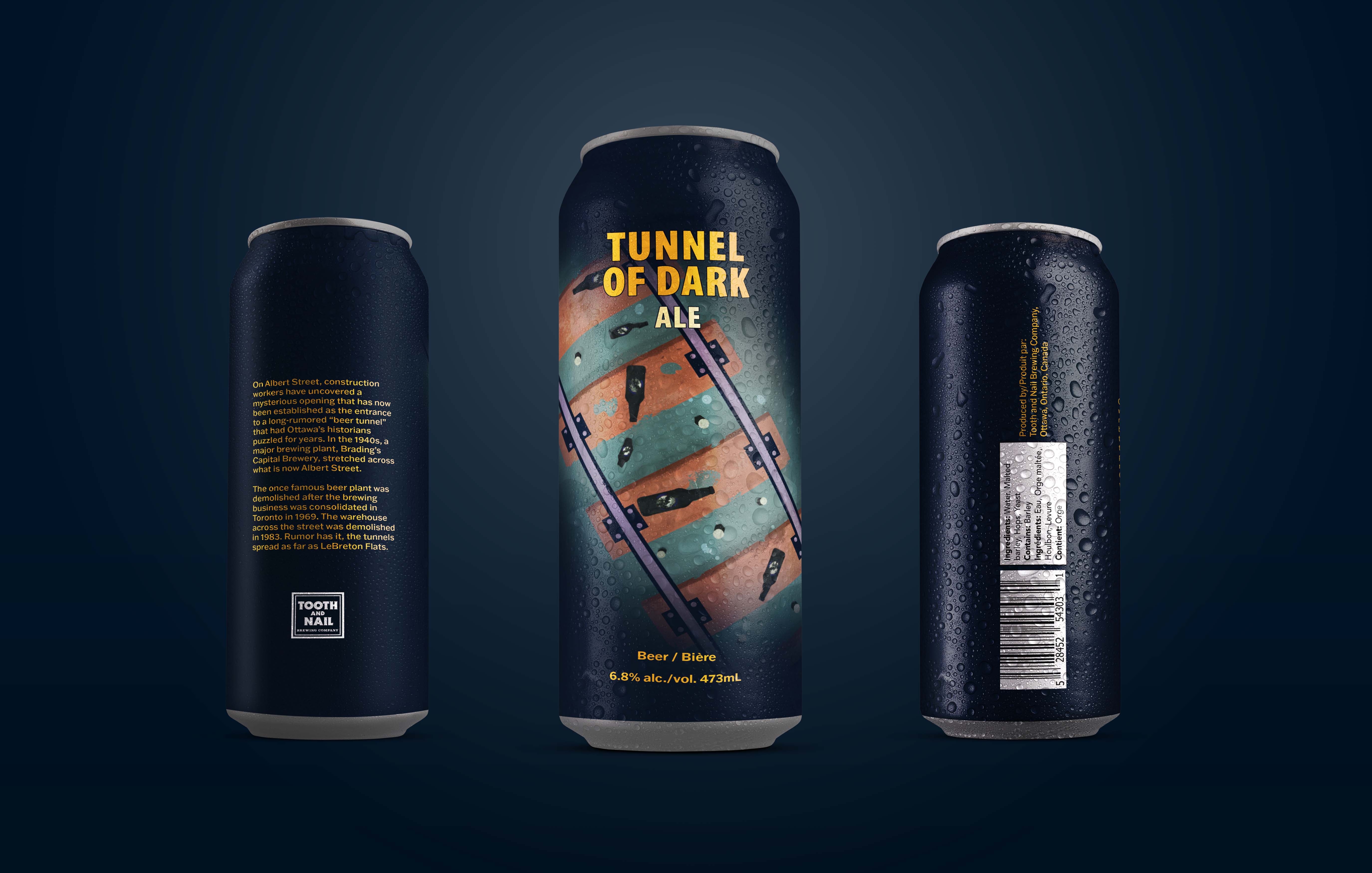
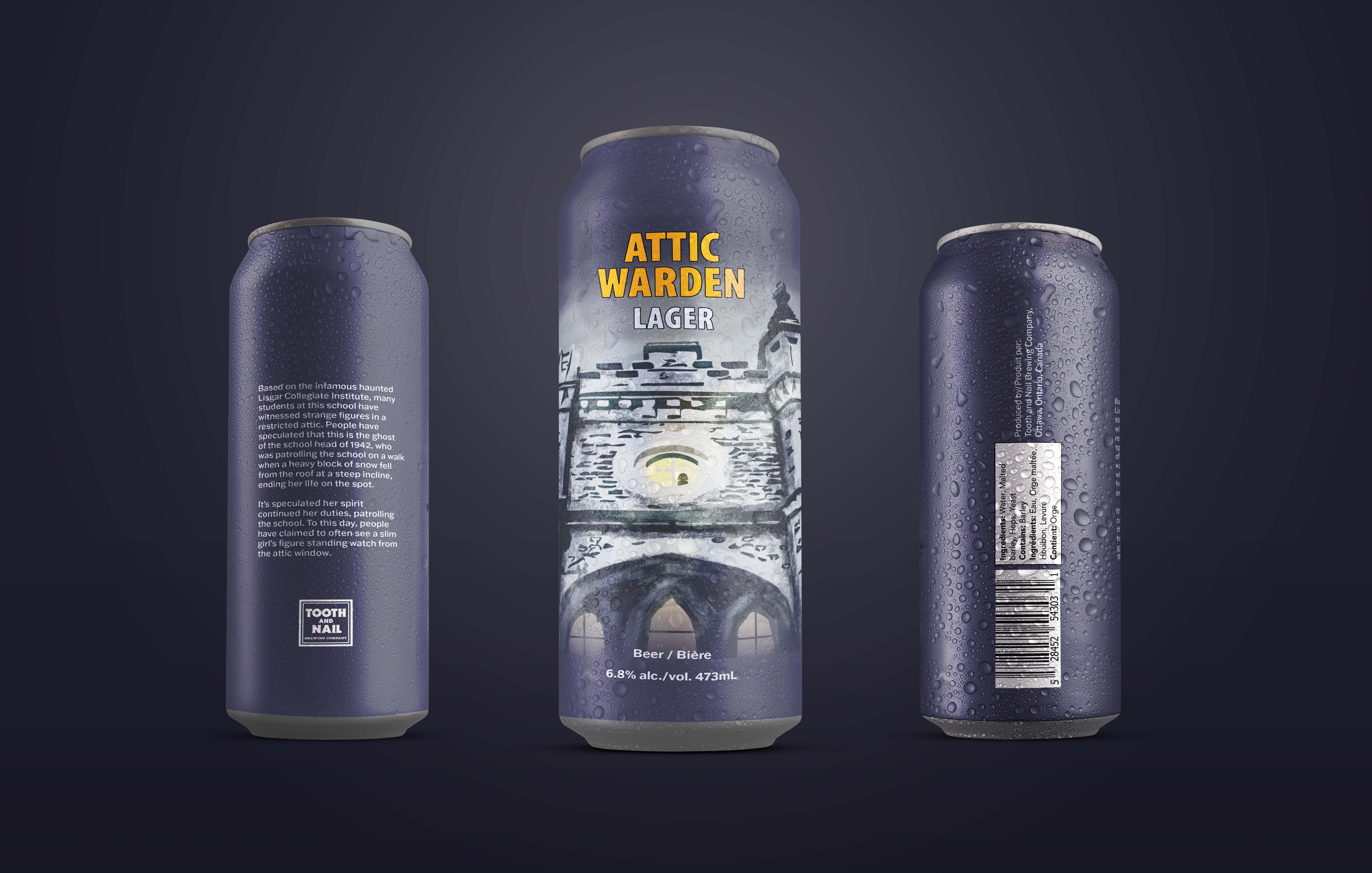
The goal was to design beer cans that would not only resonate with everyday Ottawans, but also grab the attention of those 20–40 year-olds who love exploring new beers with a fun and spooky theme. Working within LCBO's marketing and packaging restraints added a unique challenge to the project that I hadn't taken on before.
Design Process
Are you spooked yet? If not, let's take a closer look at how this came to fruition.
Research Phase
My research began with taking a deep dive into old Ottawa ghost stories like the Beer Tunnel on Albert Street and The Haunting at Lisgar Institute. These stories then evolved into dark, illustrative concepts that transformed these stories into something more than just stories.

Stylus to iPad
After research, I began sketching. I wanted to follow the source material as closely as I could while maintaining cohesion across both designs. I took the most integral components from each story and allowed the art to convey the story on its own.

Illustrator Time; Refinement Phase
Once both concepts had been finalized, I began illustrating each design in Illustrator. I wanted the colours to contrast with the brand's current colours to set them apart as their own set yet remain dark and gloomy.
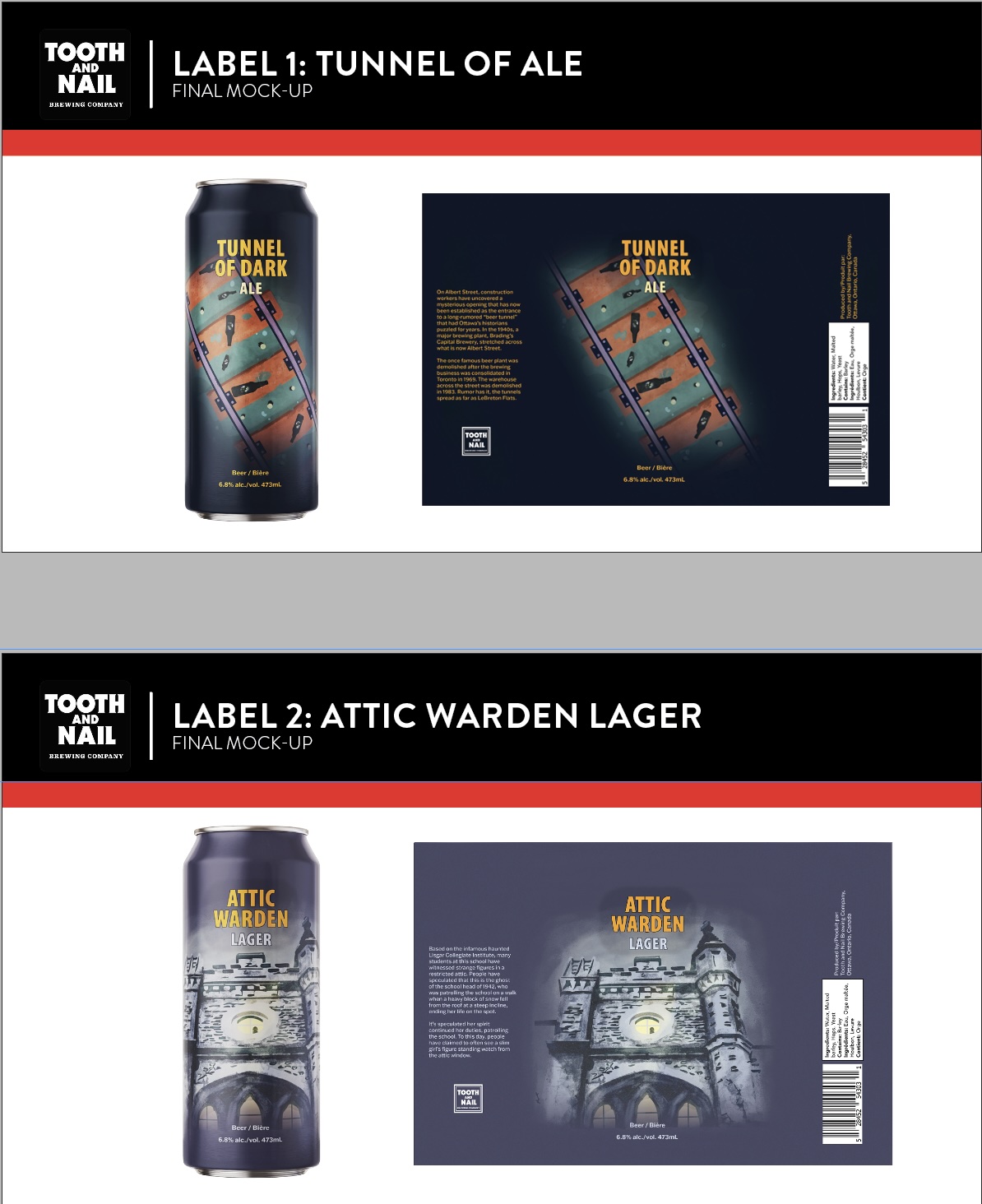
Time to Drink; Final Artwork
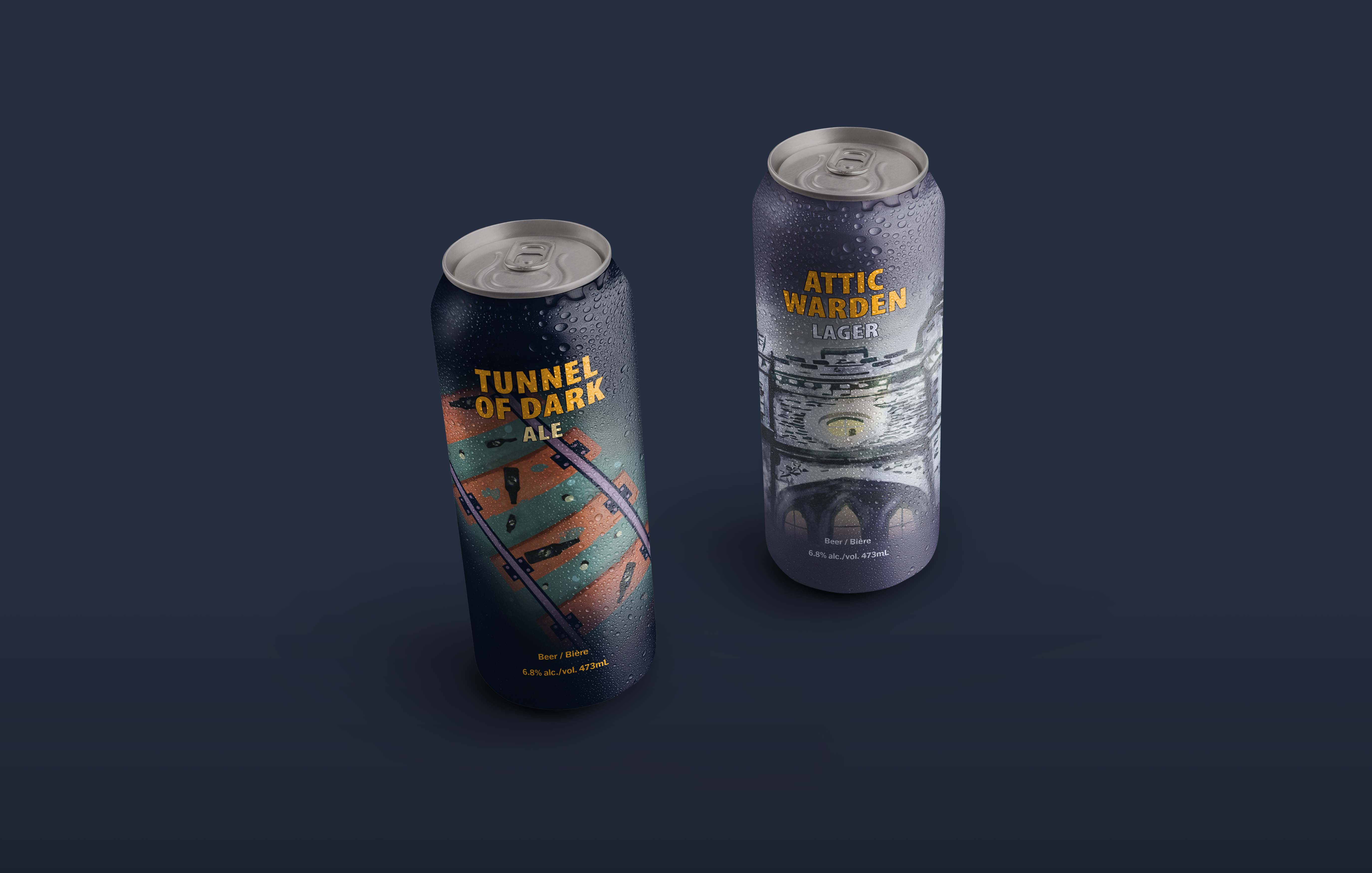
Getting everything to fit nicely around LCBO's required regulations was a challenge, but it ended up working out! These are the final cans in all their glory. I mocked them up in Photoshop for extra pizazz.
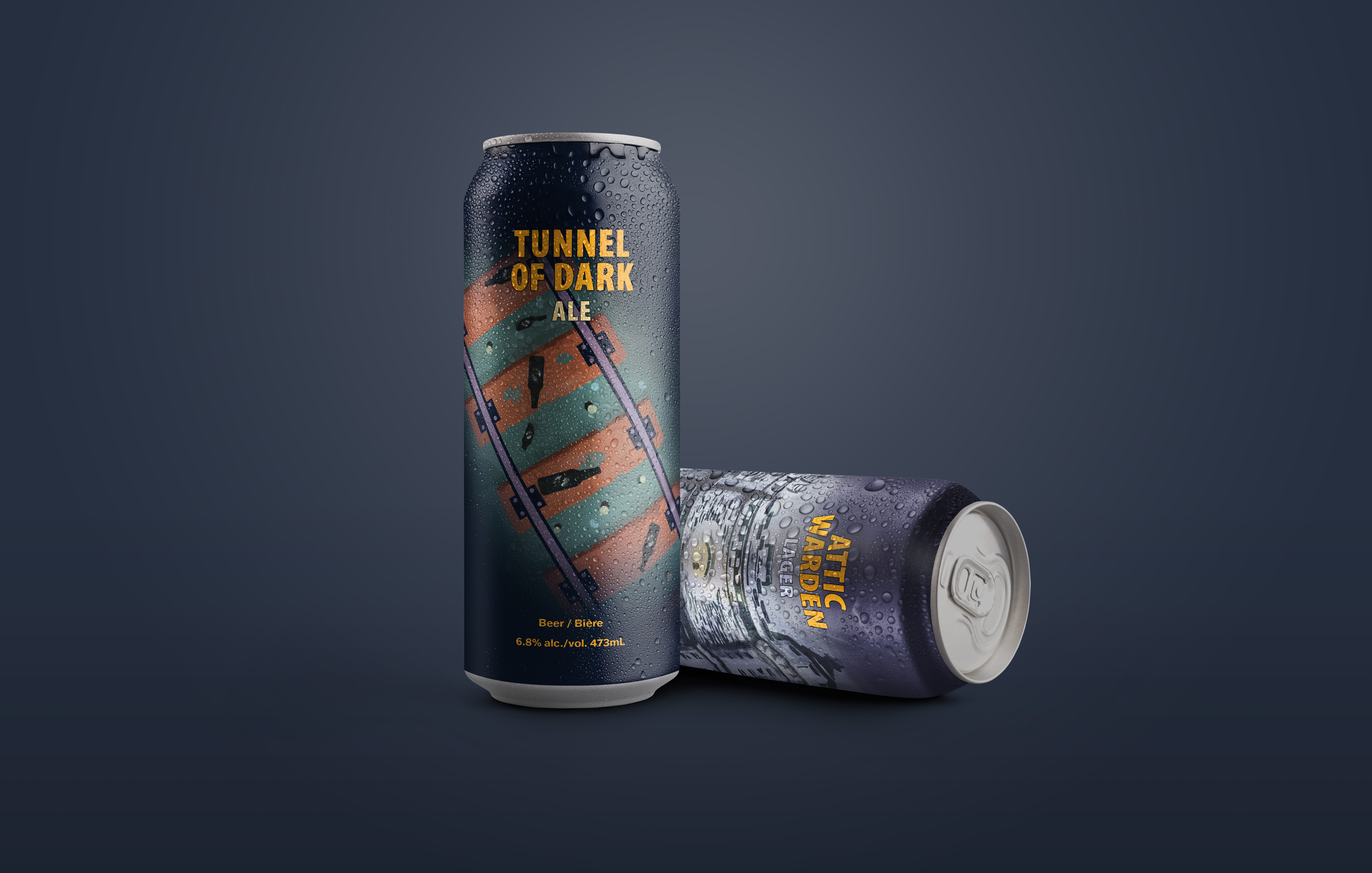
The final products reveals to be eerie, unsettling, but tells a story. As a lover of all things spooky, this was in my wheelhouse of things I enjoy creating. The cans display textures, bold font choices, and eerie illustrations that come together to create a cohesive design that feels chaotic, yet intentional. Through this project, I gained new knowledge into the inner workings of LCBO’s labelling and retail display requirements.
The Haunting of Ottawa
Explore My Other Projects
If you like my creative process, explore how my other projects came to be.

