The SconeWitch
This concept project involved redesigning the branding for a company of our choosing. I chose The SconeWitch as it's a cafe I often frequented and grew to love.
The brief was centred on creating a unique, more accurate depiction of what could be possible to elevate the current branding. It's important to note that while drastic changes are being made, the core values should still remain and be amplified. The target audience for this redesign is creatives, professionals, and students who are interested in frequenting bakeries with a cafe aged 18-40+.
The unique selling point for The SconeWitch is its expertly crafted scones, which are the star of the menu. They offer a unique twist on traditional sandwiches. It is both a cafe and a full-service bakery. By continuing to align with the brand’s mission of creating meaningful, cozy, and whimsical moments in the cafe, the branding redesign sought to amplify that emotional connection to the food, but also the atmosphere and aesthetics.
The main objective for this redesign was to Increase traffic to their current stores and boost in-store sale, while maintaining and amplifying their cozy, whimsical atmosphere.
Design Process
Follow me as I take you through the fun, all-encompassing journey that brought us to the final product we saw at the beginning.
Research
Research began with a deep dive into The SconeWitch's values, current branding, and how they present themselves to the world.

Where The Magic Began
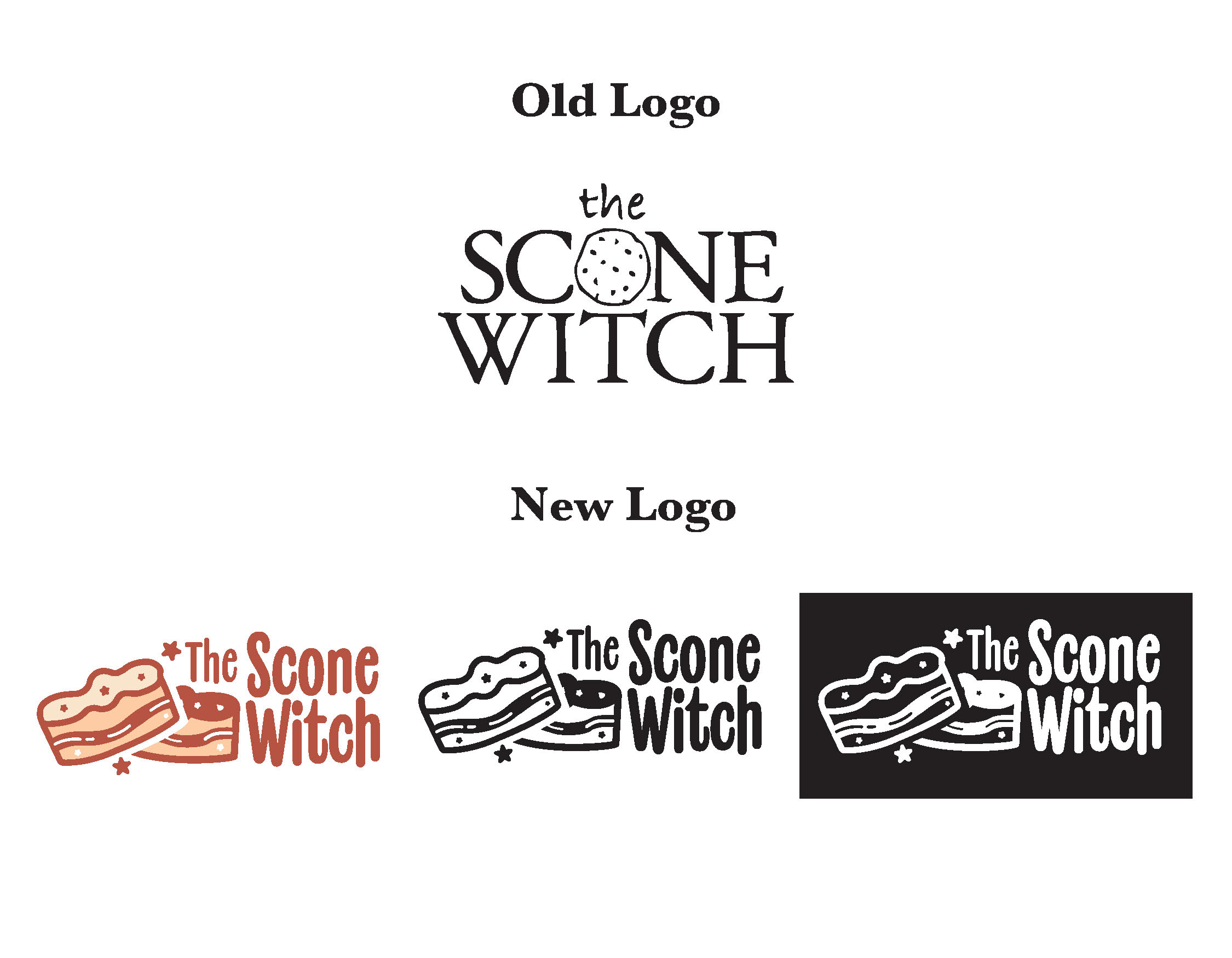
This is where the initial sketching took place. Lots of ideas, it was hard to narrow it down. But I wanted something understated, yet still showing personality.

Getting Closer; Iterations
After getting a shape I was mostly happy with, I started experimenting with various colour combinations until one made sense for the brand and accessibility.

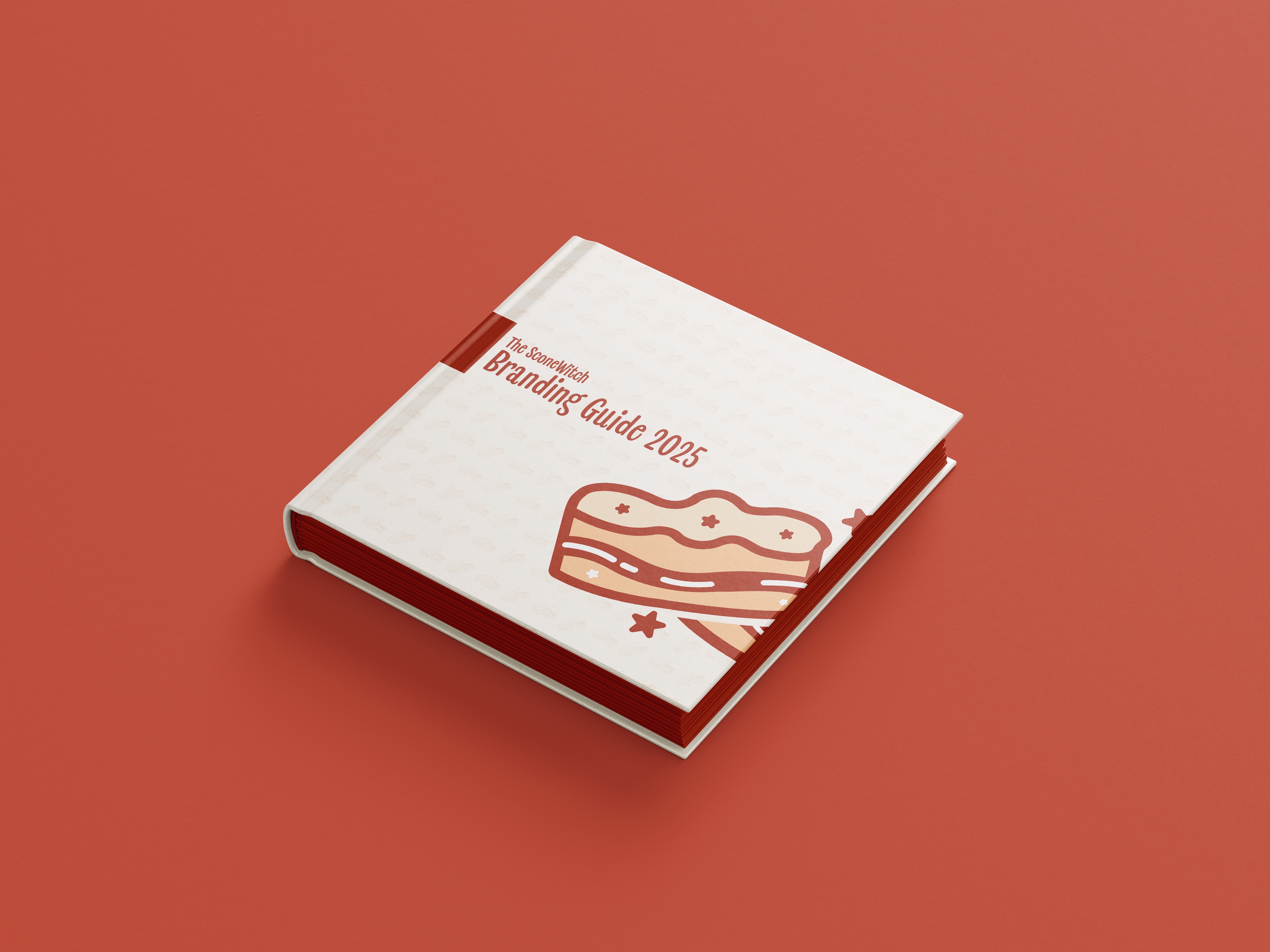
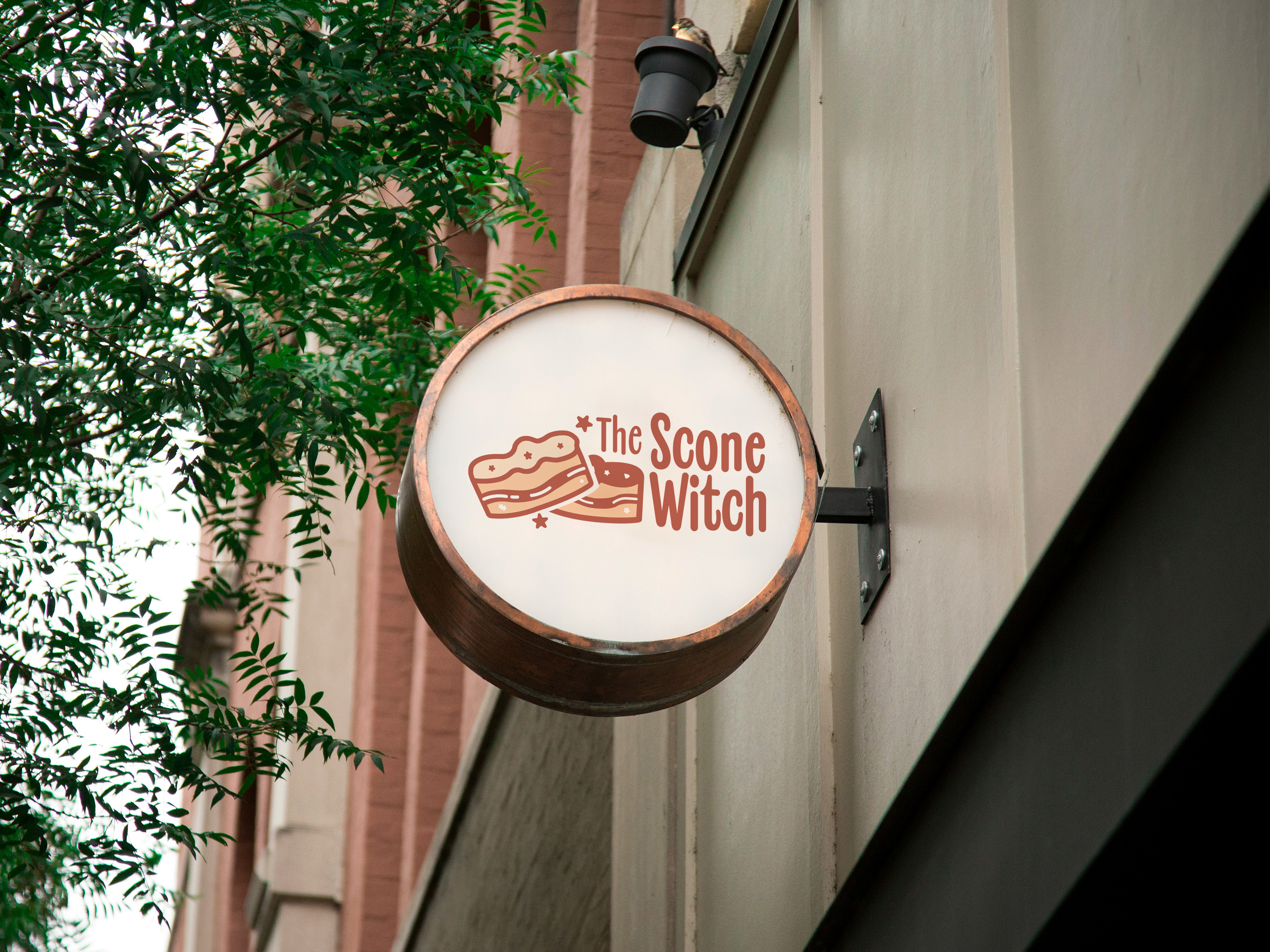
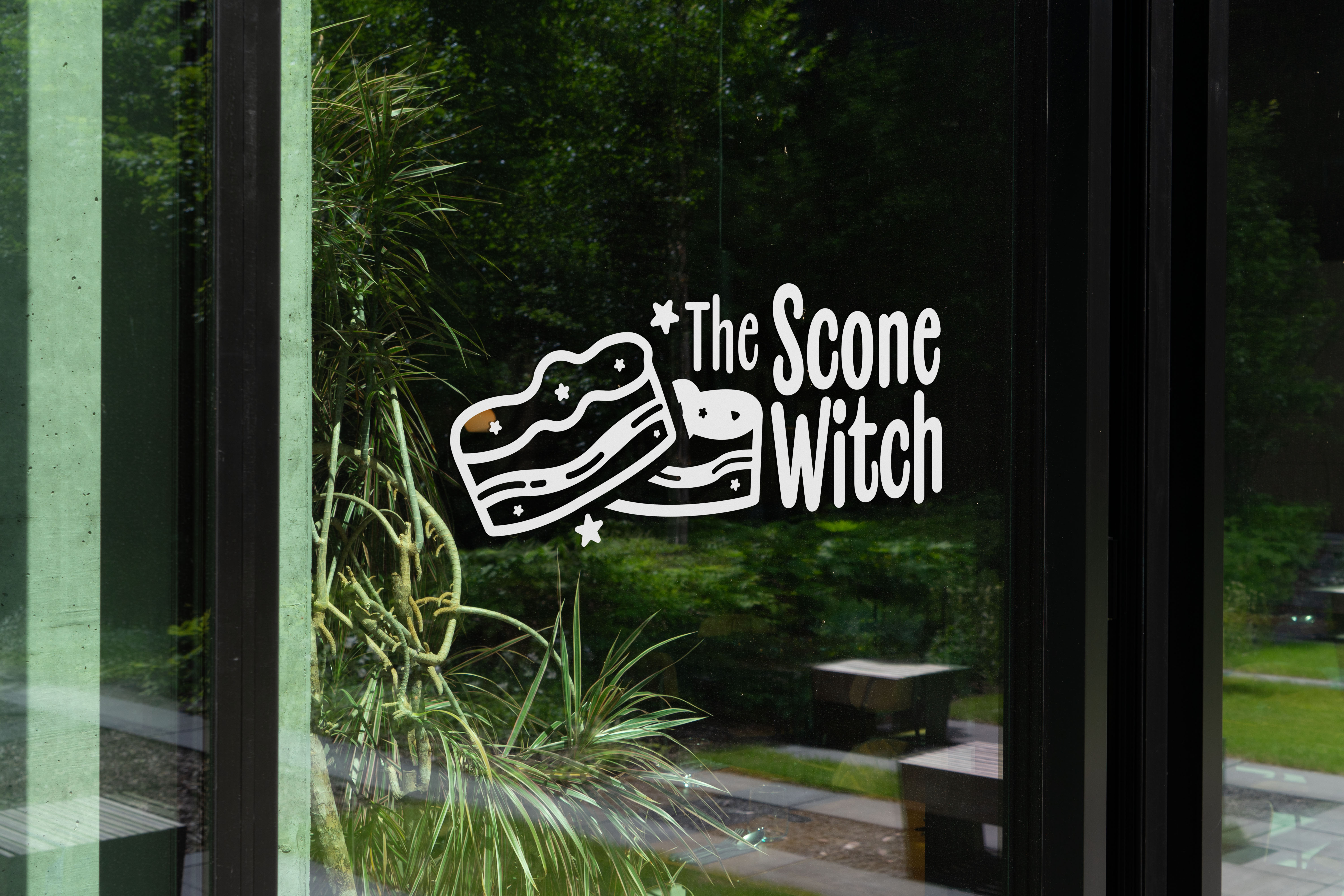
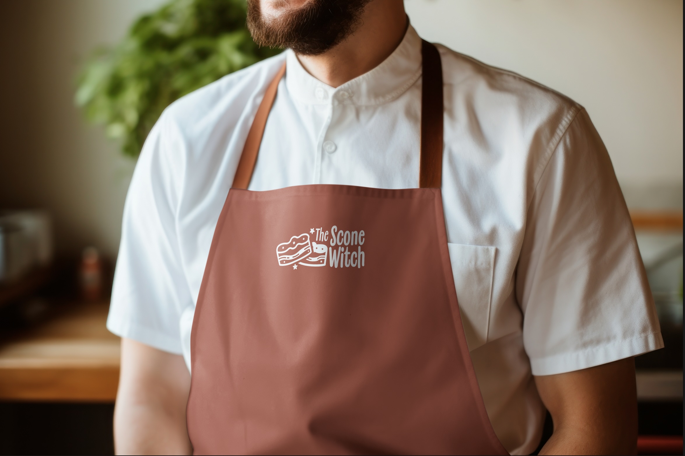
Finish Line!
After all the blood, sweat, and tears poured into the many... many iterations that were done. This is the final colour and illustration. It was finally ready to be pushed off for production of the branding guide.
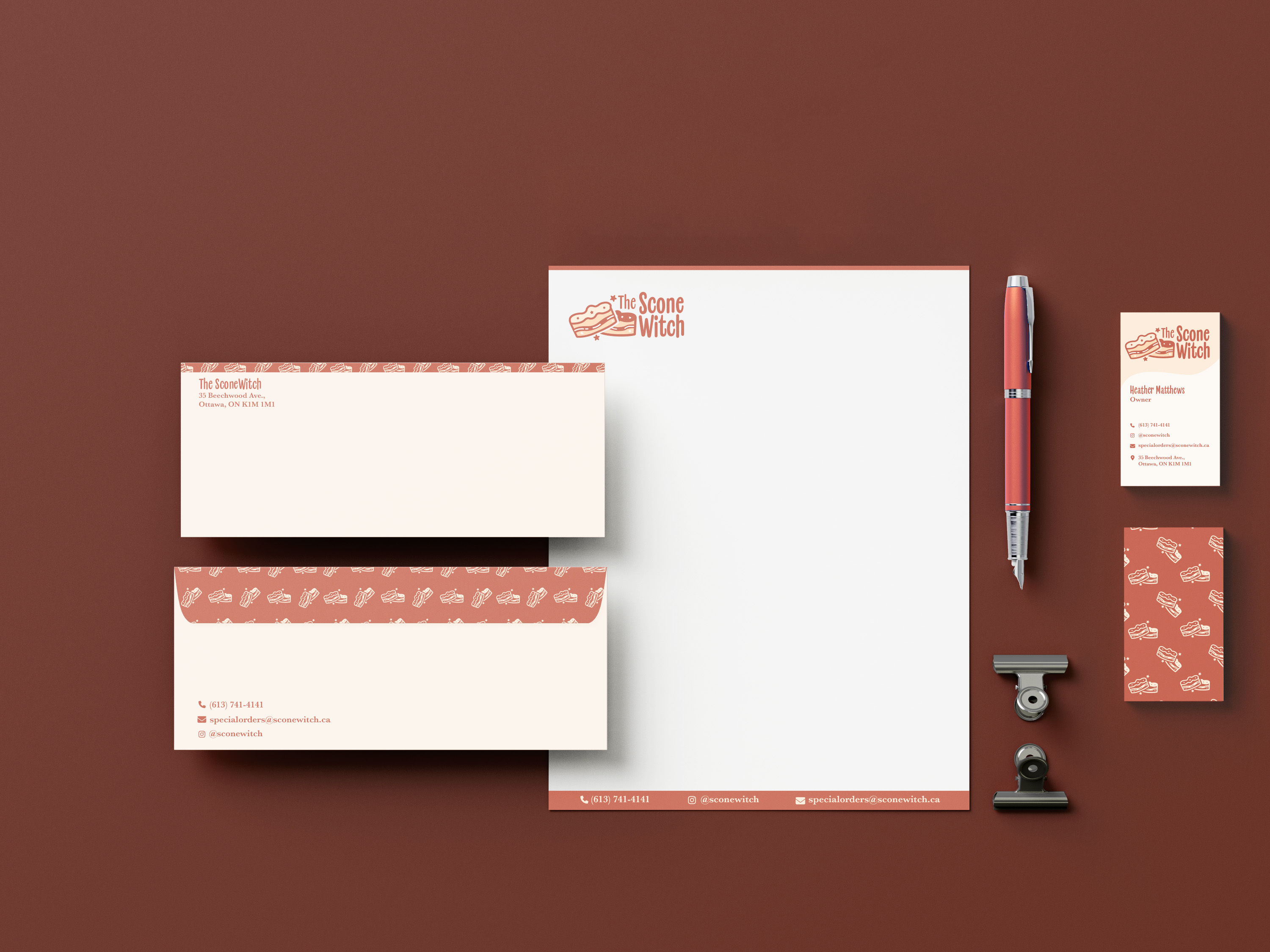
The final design encapsulates blending aesthetic appeal with functionality. The whimsical, warm illustrations brought out the true spirit of The SconeWitch to the fullest.
For this project, it was my first real attempt at working within the constraints of an existing brand identity. It has been a fun, memorable experience. This project reinforced my love for detail-oriented problem-solving. This project was pivotal in getting me outside of my comfort zone, and being even more open to trying different styles as a designer.
The SconeWitch
Explore My Other Projects
If you like my creative process, explore how my other projects came to be.